Varian BRAVOS Afterloader
For our capstone project at UCI, we partnered with Varian, a medical technology company specializing in cancer treatment delivery. The UI/UX of the BRAVOS afterloader software that administers radiation treatment to patients was outdated, lacked user accessibility, and was inefficient in layout, leading to difficulty reading important information on screen. So, we asked ourselves, how might we streamline Varian’s BRAVOS brachytherapy treatment delivery workflow to minimize the time treaters spend navigating the software to reduce overall treatment time for patients? I lead our team and participated as a UX designer to streamline the BRAVOS software used for administering radiation to patients. My group and I conducted interviews with radiation therapists to learn about their daily routines and what information they valued most, as well as identifying their pain points like text size and clarity of visual display of treatment progress. We used our research to improve the experience of using BRAVOS in an iterative cycle of design and feedback, creating a product that users found easier to use during usability testing. The result was a successfully streamlined design that took into account user needs that integrated Varian’s branding and focused on the data that matters most to users.
Duration: March 2023 - September 2023
Role: Project Lead, UX Designer
Double Diamond Design Process
-

Discover
I conducted research with my team to determine areas of opportunity and improvement, such as the need for clear workflow indicators.
-

Define
My team and I narrowed down our priorities to making information larger and easier to find, as well as being able to track progress.
-

Develop
I designed one step of the treatment workflow, starting from Crazy 8's ideation to creating high fidelity mockups in Figma.
-

Deliver
My group and I conducted usability tests and made adjustments to the high fidelity designs based on user feedback for our final version.
Discover
-
Heuristic Evaluation
We identified usability issues and design inconsistencies with the existing BRAVOS software to identify areas of opportunity. (Image is blurred for privacy)

-
Competitive Analysis
We assessed the current effectiveness of the Bravos software UI and its value proposition compared to its competitors, and proposed strategies to make it more intuitive.

-
User Interviews
We conducted interviews with radiation therapists to learn about their job and how they interact with radiation technology and software in their day to day lives to identify further areas of opportunity.

Define
We conducted affinity mapping, created user personas, and a user journey map to craft a problem statement that encompassed user needs:
How might we streamline Varian's BRAVOS brachytherapy treatment delivery workflow to minimize the time treaters spend navigating the software to reduce overall treatment time for patients?
Develop
-
Low Fidelity
I built a simple framework for what I wanted my screens to look like on a functional level. I focused on button placement and table placement.

-
Mid Fidelity
I refined my ideas based on partner feedback as we finalized button placements, color, and important elements.

-
High Fidelity
We finalized colors and I added visual emphasis on highlighted rows and buttons to make sure the most important information stood out.

User Testing and Feedback
We tested our design with users, who found our design to be intuitive and easy to use. They did find some items hard to read, so we tried to make sure text was larger where needed and important elements stood out.
From our partner, we discovered they wanted us to follow their branding more, so we changed the color scheme to a Varian themed color scheme.
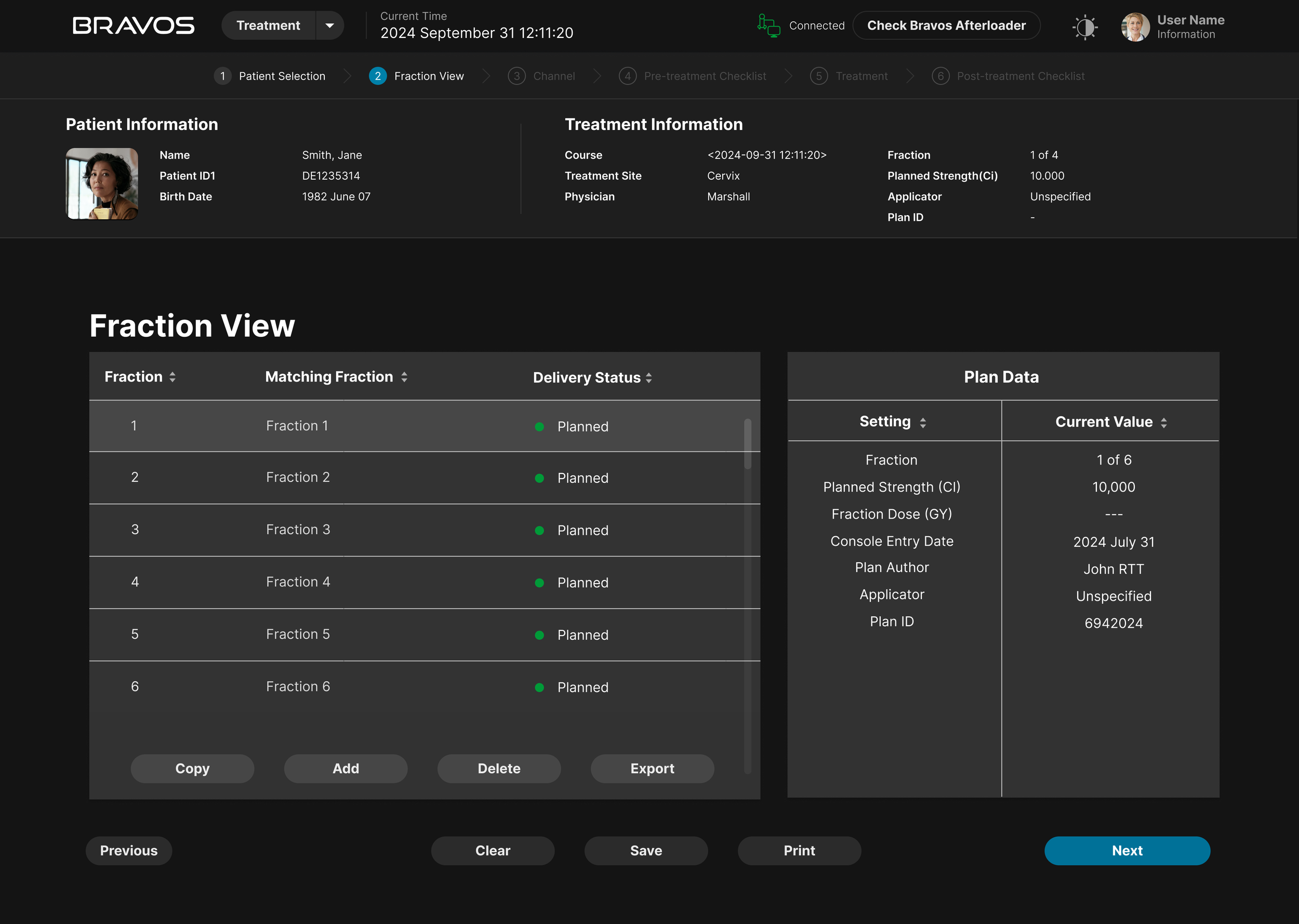
Final Prototype
We were able to streamline the BRAVOS user experience by making information easier to find and read on the screen. We also made it clear in the navigation where the user is located. We were also able to take our partner’s business needs into account by using their colors and branding to make it distinctly Varian.
-
Key Takeaways
Learning how to balance user needs and business needs was an important takeaway from this project. My group and I had to learn about and create a redesign of existing software that would better serve user needs, and we successfully took on the challenge with this project.
-
Next Steps
I would conduct further user testing to refine the design further. We were told that we could explore different design choices, so further learning of the subject matter to determine essential elements would also be key in this.

